Improving AT&T's Progression Buyflow
Spotted that customers were reaching checkout just to find out what something cost, and introduced a running price estimate that follows them from the first step. It lifted progression, add to cart, and conversion.
- Company
- AT&T
- Year
- 2025
- Role
- Product Designer, Research & Innovation
- Category
- Product Design
- Figma
- Adobe Analytics
Context
AT&T had two separate ways into a wireless purchase. A customer could browse a specific phone on a product page, or shop plans first and pick a device later. Neither path carried a price forward.
So a customer testing different plans, line counts, or devices had to re-enter the buy flow from scratch every time they wanted to see a new number. The only place a real total appeared was checkout.
Problem
This one started as an observation rather than a brief. Nobody asked for it.
Watching how people moved through the buy flow, the pattern that stood out was customers going all the way to checkout with no intention of buying anything. They were not abandoning. They were using checkout as a price calculator, because it was the first screen that would tell them what a configuration actually cost.
That is an expensive way to answer a simple question, and it explains a lot of behavior that otherwise looks like abandonment. Every comparison meant losing your place: leave a device page to check plan pricing, or leave the plans page to look at a phone, and the estimate you had been building was gone. The two entry points did not talk to each other.
The opportunity I put forward was to stop making people travel to the end of the flow to get a number, and instead give them the estimate at the point where they start making choices. If the price follows the customer, comparing options stops costing them their place, and the flow stops being the only calculator available.
Solution
A persistent price estimate that attaches to both entry points instead of one.
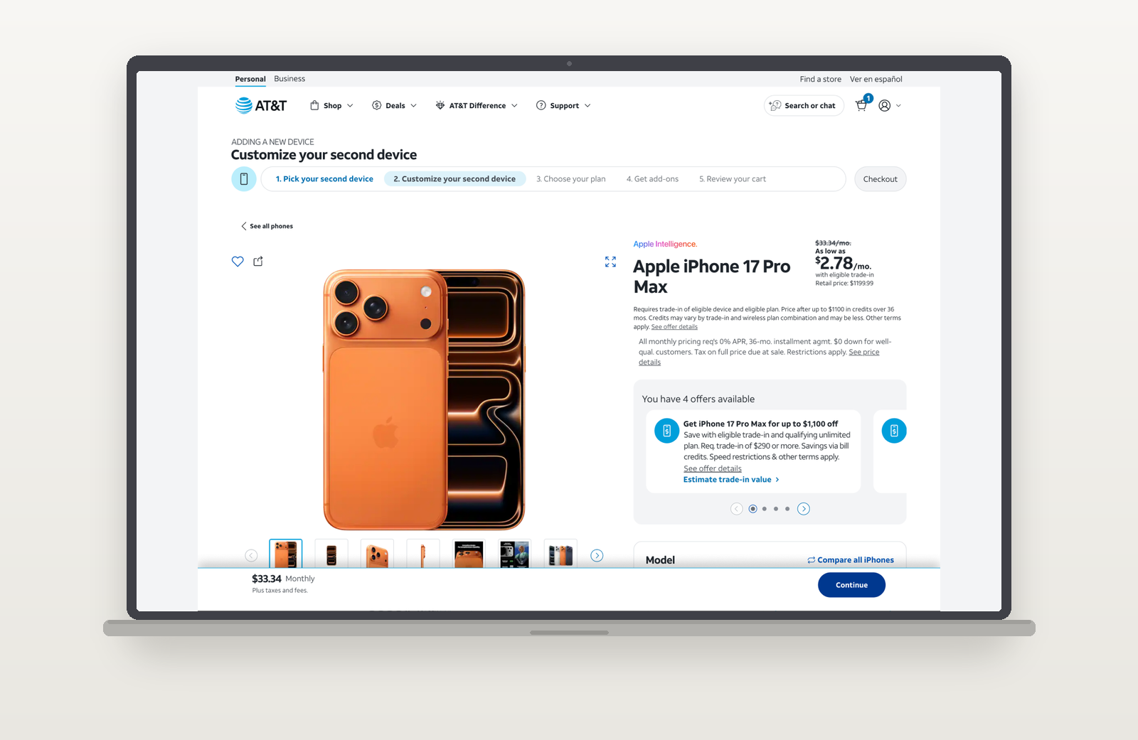
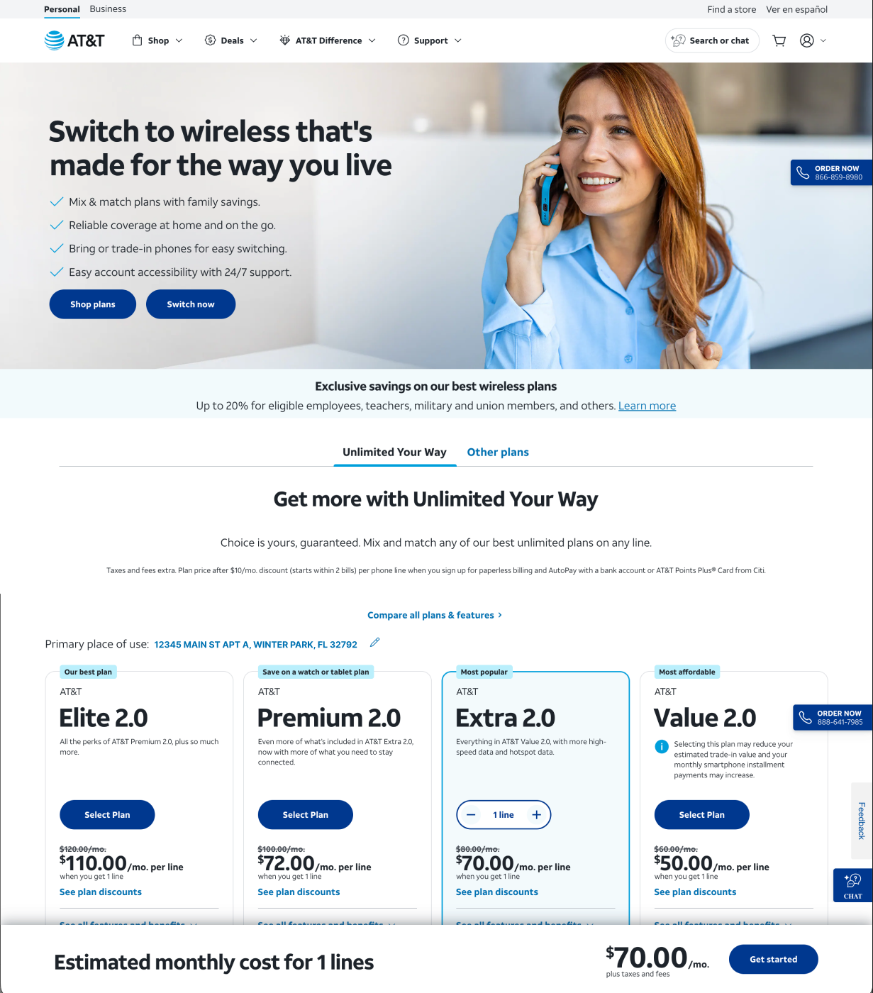
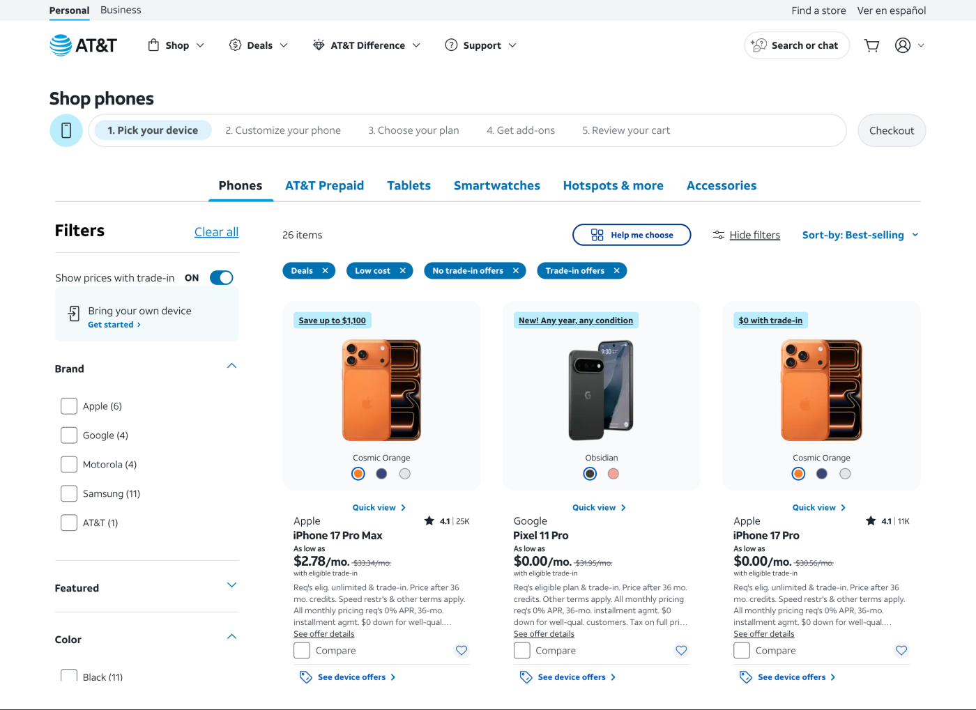
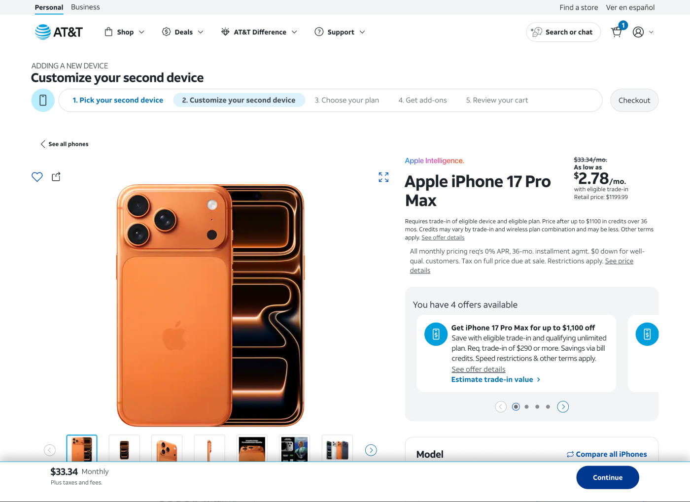
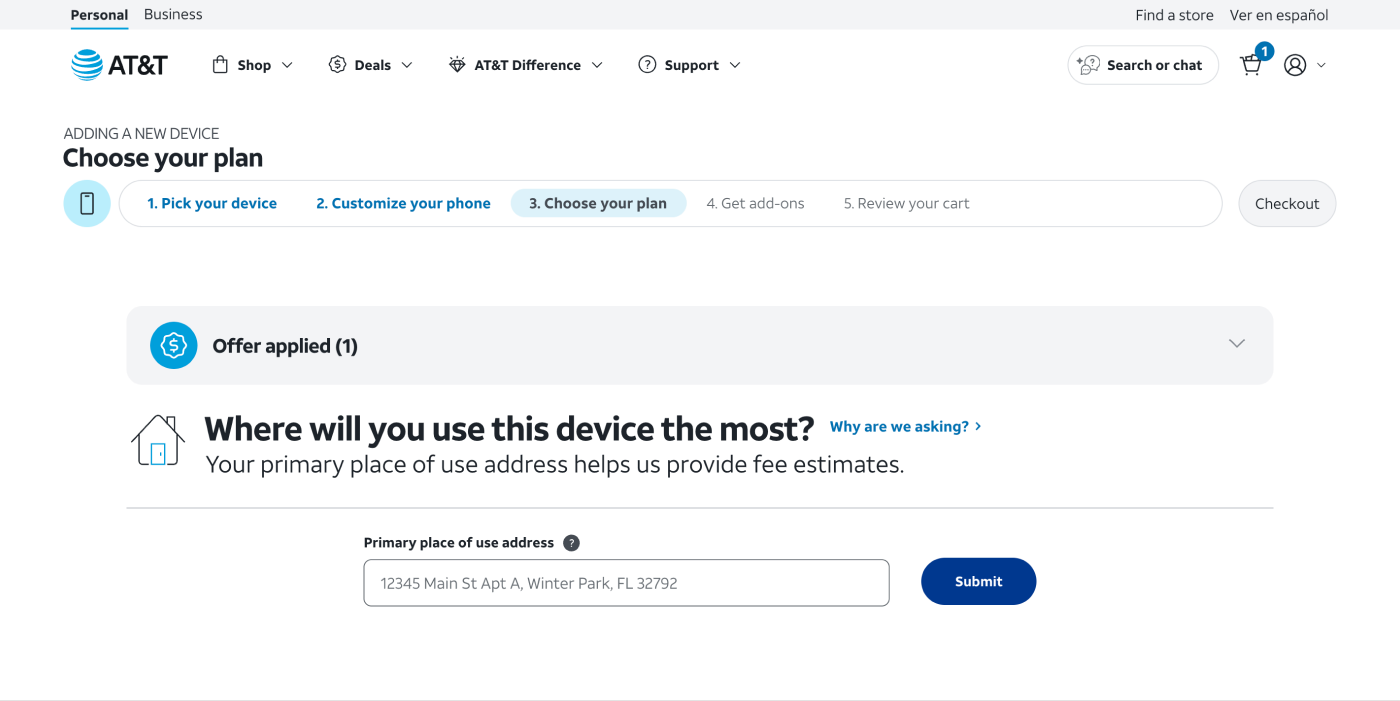
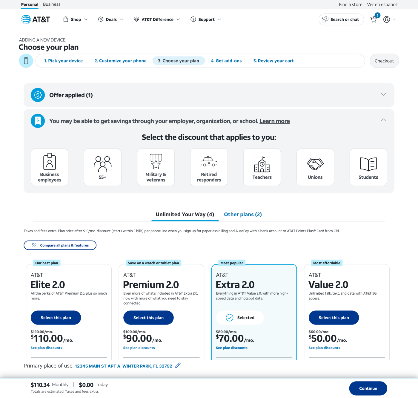
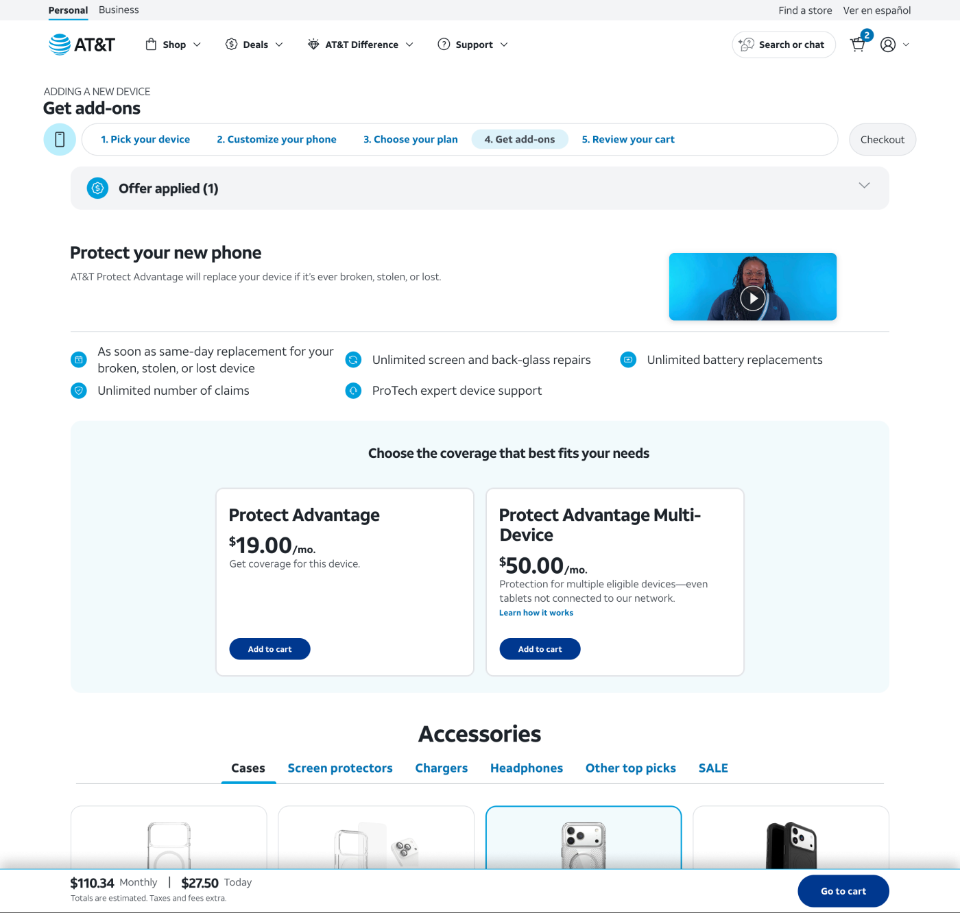
Start on a specific phone's product page, or start by shopping plans, and the sticky follows either way, updating as a plan, device, or address gets added rather than waiting until checkout to show a number. The customer can change their mind about a line count or a device and watch the figure move, without leaving the page or restarting.
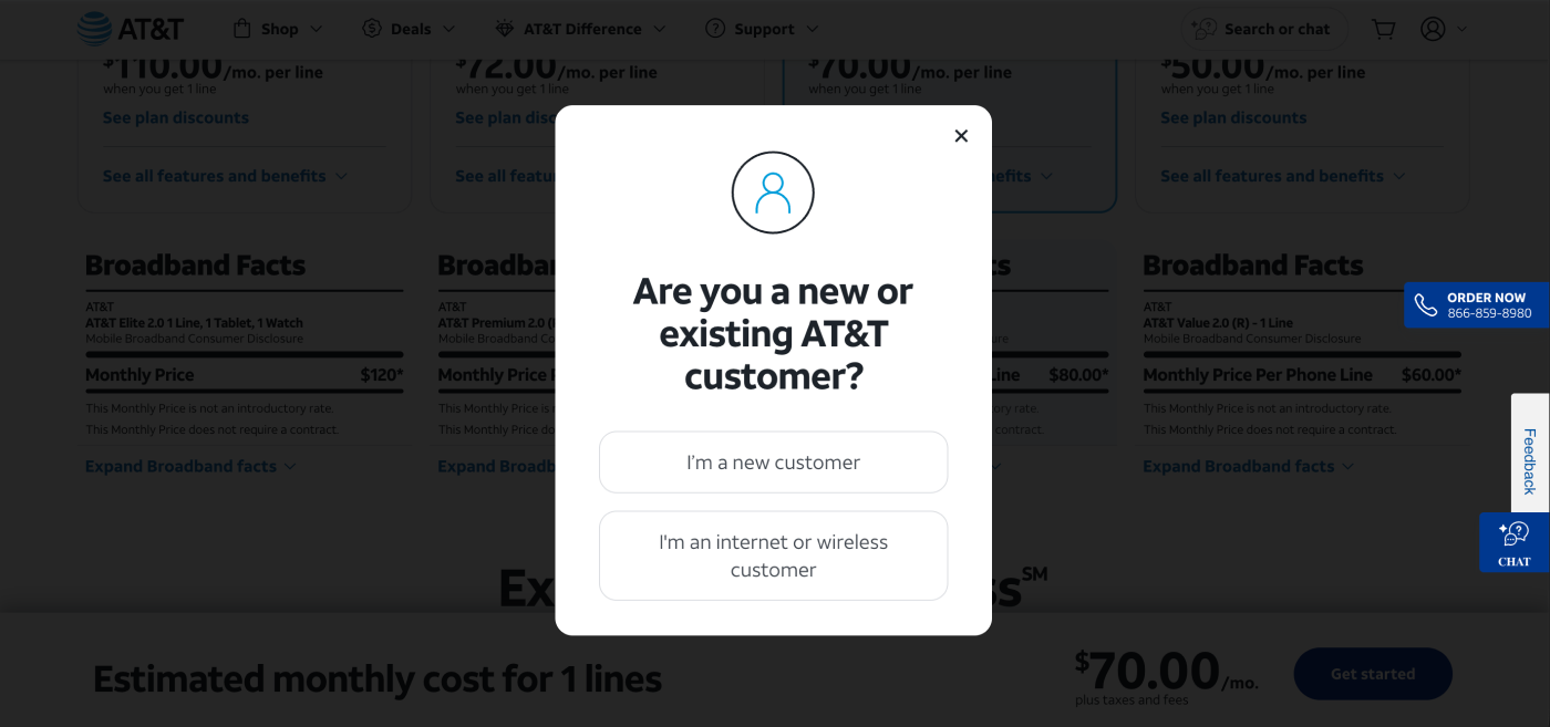
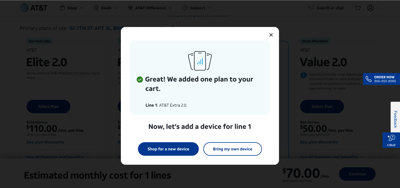
Partway through the plans path, after a plan is chosen, a short check asks whether the customer is new to AT&T or already has service. Either answer leads to the same next step, adding a device, which is really the start of the product-page flow reached through a different door. What changes is what is waiting there: an existing customer sees offers personalised to their account, a new customer sees deals for the address they entered.
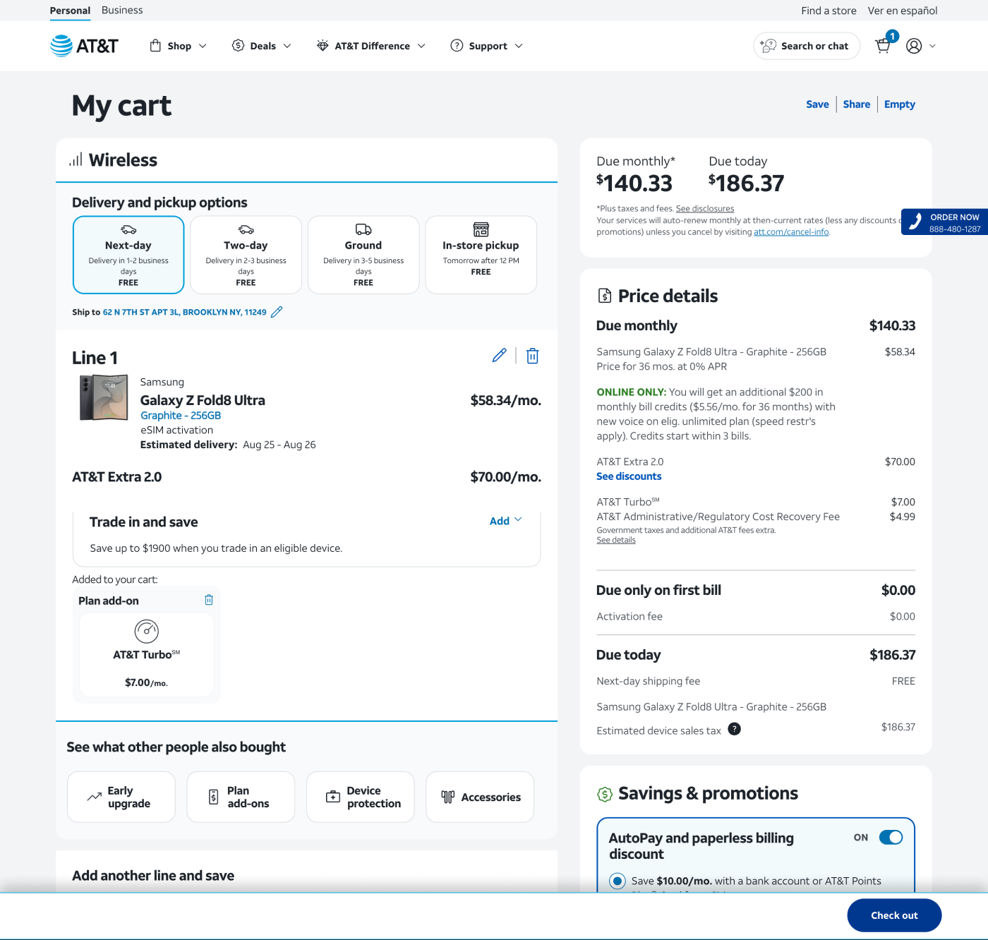
The component changes shape as the customer moves rather than staying static, because what is worth showing changes at each step. It opens as a flat monthly number at the device step. Once a plan and address are attached, it picks up the address as an editable line alongside a due-today total. Later the address recedes and the total updates for what is actually in the cart. By checkout it is down to a single button.
That last part matters more than it looks. A price bar that shows everything at every step becomes furniture people stop reading. Showing only the number that is in question at that moment is what keeps it useful all the way through.

Customer Journey
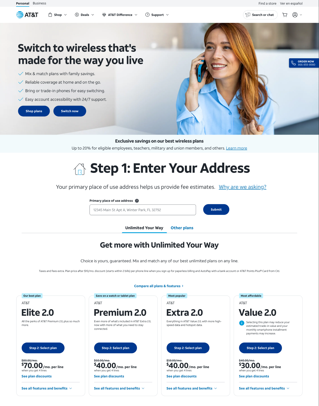
The Wireless Plans path: start browsing plans, land on an address, watch the sticky pick up a plan and price as you go, then hit a quick new-or-existing check before bridging into the device flow.
The Product Listing Page path: start on a specific phone instead, and end up in that same device flow, picking a device, customizing it, choosing a plan, adding extras, reviewing the cart, the sticky updating at every step.
Impact
Shipped across both entry points.
It moved the three things it was designed to move. Progression through the buy flow improved, because customers no longer had to reach checkout to learn a price. Add to cart improved, because the decision to add was being made with the cost already visible rather than as a leap. And order conversion improved, because fewer of the people arriving at checkout were there purely to look up a number.
The structural change underneath those numbers is that pricing stopped being something the flow revealed at the end and became something the customer carried with them from the start.
Learning
Two doors do not need two destinations. Whether someone starts by picking a phone or picking a plan, they are working toward the same cart. The design followed that logic. One shared price-tracking mechanism the whole way through, and a single point where the path splits just enough to put the right offer in front of each person, before reconverging.
The more useful lesson is about where the opportunity came from. Nobody briefed this. It came from noticing that people were using checkout for something it was not built for, and treating that as a design signal rather than as noise in the funnel. Customers reaching the last screen and leaving looks like a conversion problem. It was an information problem several steps earlier, and it was cheaper to fix there.