Daikoku NYC Platform
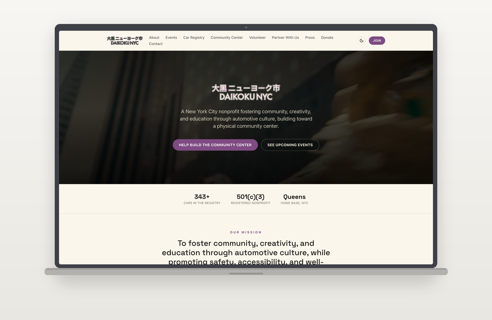
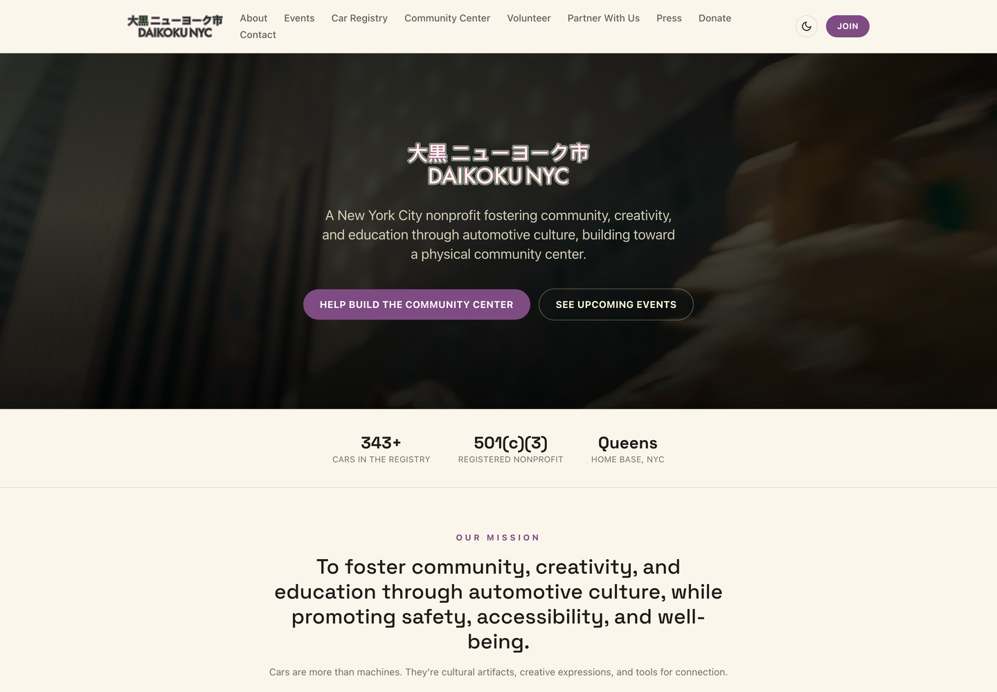
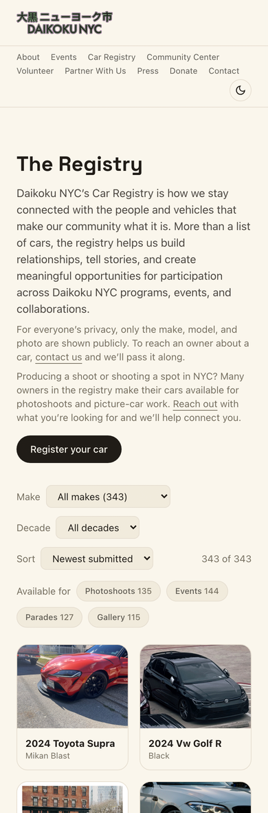
The nonprofit I run was operating on a form builder and a spreadsheet. I designed and built its replacement: a public site, a searchable registry of 542 member cars, event sign-ups, and the back office that runs all of it.
- Company
- Daikoku NYC
- Year
- 2022 – Present
- Role
- Founder, Designer, and Engineer
- Category
- Product / 0→1
- Figma
- Next.js
- TypeScript
- Tailwind
- Supabase
- Vercel
- Claude Code
Context
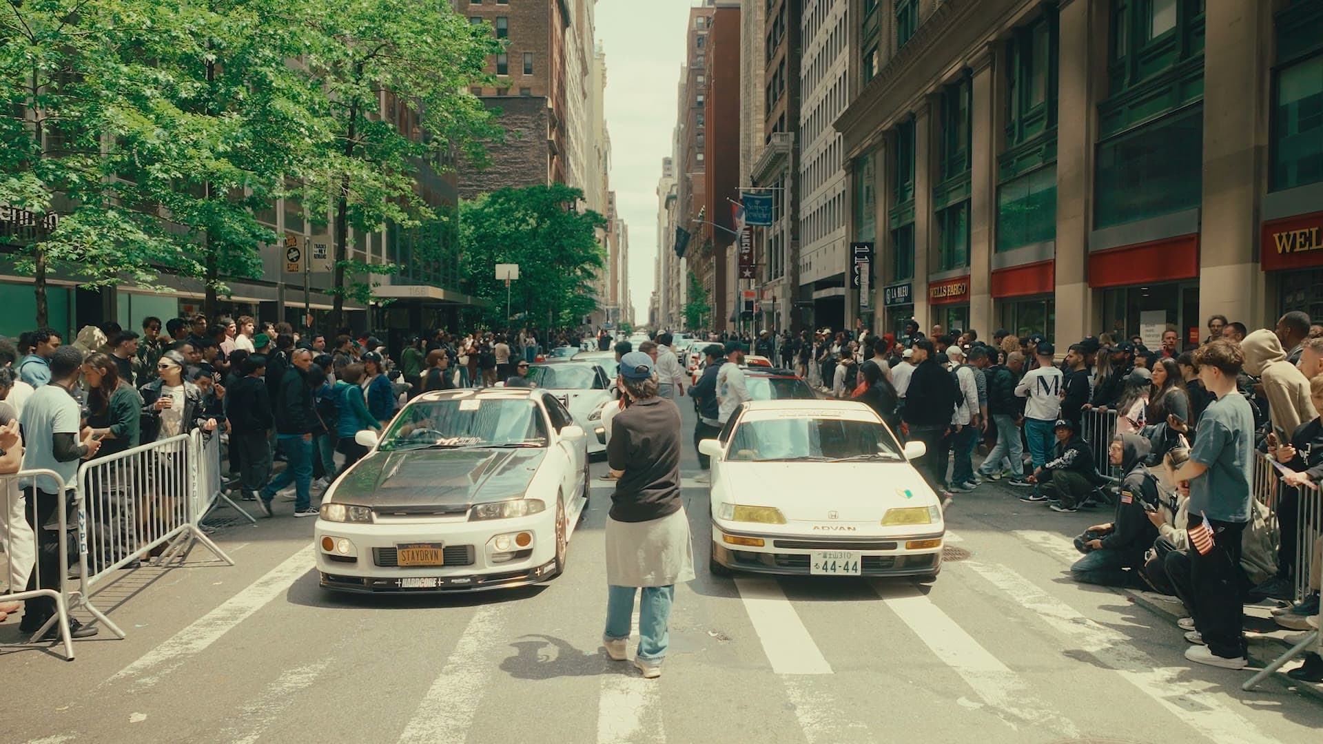
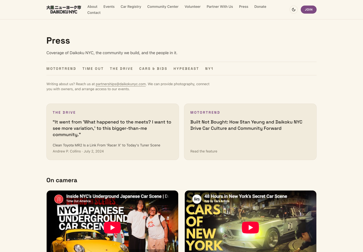
Daikoku NYC is a car culture nonprofit I founded and still run. Five hundred and forty-two people have registered their cars with us. We organize a car show on Sixth Avenue for the AAPI Heritage Parade, and the organization has been covered by MotorTrend, Time Out, The Drive, Cars & Bids and Hypebeast.
All of it ran on a form builder and a spreadsheet.
Every person who wanted to join filled out a web form. I read those submissions by hand. Their car photos lived on someone else's servers. When a producer emailed asking whether we had a clean 1990s Japanese coupe available for a shoot, the honest answer was that I would need an afternoon to go and look.
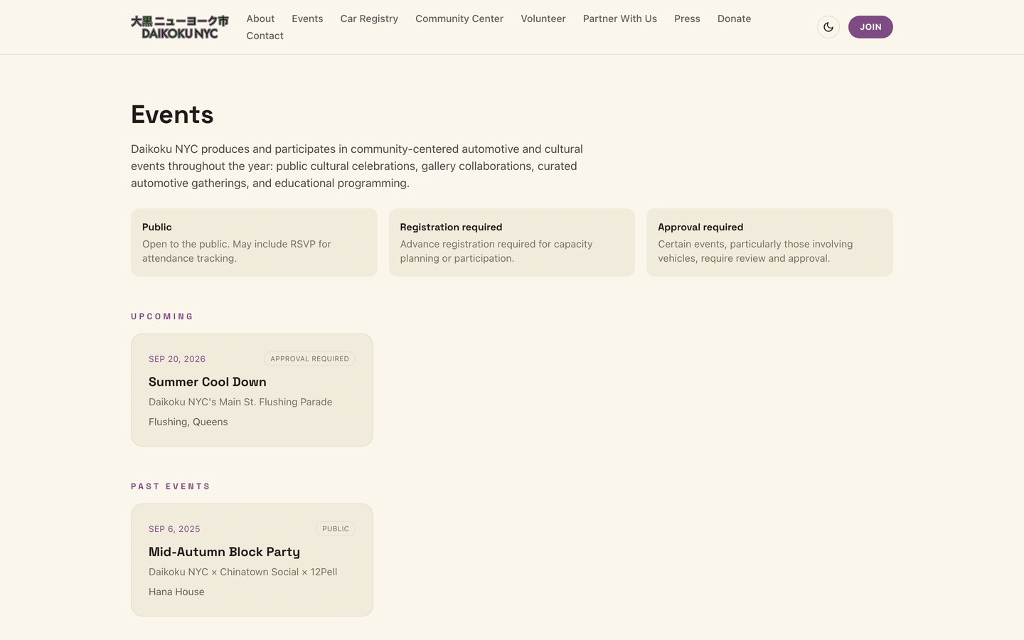
The organization had outgrown its tools years before I sat down to replace them. I designed and built the replacement myself, over about two weeks: the public website, the car registry, event sign-ups, email and text campaigns, donations, and the staff tools behind all of it.
Problem
I started by writing down what each group actually comes to us for, because they want different things and the old setup served none of them well.
Members want to be seen. They put months into a build and they want it somewhere real, connected to a community, not buried in a spreadsheet cell.
Producers and location scouts want to search. A film or commercial needs a specific car, available on a specific date. This is where the old system failed hardest: we had hundreds of cars and no way to answer a simple question about them.
Event organizers, which mostly means me, want to know what needs a decision today. How many people signed up. Who is waiting on an answer. Whether we are near capacity.
The general public wants to know what this is and whether they belong. Car meets carry an unfair association with street takeovers. The site had to actively work against that.
One more constraint shaped everything: this had to be run by other people. Anyone with a daikokunyc.com email can sign in and handle the day to day, approving cars, working an event's registration queue, sending a campaign. Payments and site settings stay restricted to one account. That meant designing for someone who opens the tool once a month and needs to work out what to do in about ten seconds, not for a person who already knows where everything is.
Solution
The registry became the center of the site, and the design question was what people search by.
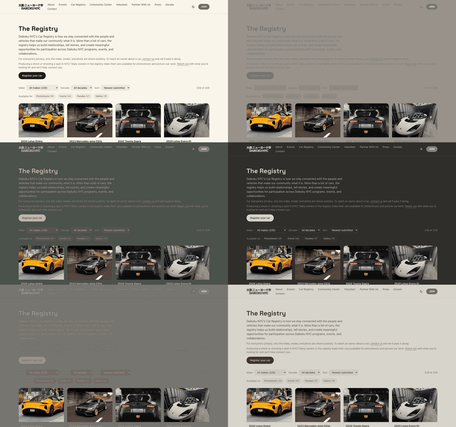
Not make and model, it turned out. Producers search by intent. So the filters are the things a person actually asks for: what the car is built for, and what the owner has agreed to. Owners tell us at sign-up whether their car is available for photoshoots, events, parades or the gallery, and those became one-tap filters. Someone looking for a picture car now gets from the homepage to a shortlist in two clicks: 135 of the 339 public cars have been offered for photoshoots, and that is one tap away.
Privacy shaped the layout. Only the make, model, color and photo are public. No names, no contact details, no locations. Reaching an owner goes through us, which protects members and keeps us in the loop on work we might help place.
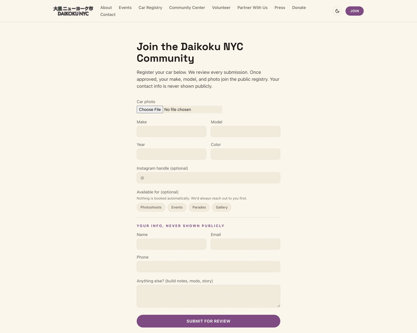
Sign-up had to be honest about effort. Cars brought to an approval-only event need at least three photos, because approving a car nobody has seen is a coin toss. The form says why it is asking, uploads run one at a time so a phone on mobile data does not choke, and the submit button stays disabled until the uploads finish.
The staff tools are organised around decisions rather than data. The navigation carries a count of what is waiting, so a backlog is visible without opening anything. Before sending an email or a text, the screen shows exactly how many people will receive it. The text composer warns when a single emoji will double the bill, which it does, by cutting the characters allowed per message from 160 to 70.
The one piece of pure delight: the site follows the sun over New York. Light between sunrise and sunset, dark the rest of the time, calculated from real sunrise times so it drifts with the seasons the way the meets do.
Customer Journey
A member arrives from Instagram, taps Register your car, adds photos and picks what the car is available for. They get an email confirming where things stand, either "you are in" or "we review every entry and will write either way." Their car appears in the public registry once approved.
A producer lands on the registry, filters to cars available for photoshoots, and sends one message. We connect them to owners rather than handing over contact details.
An organiser opens the back office and sees what needs them. Twelve registrations awaiting review. One click into the queue, approve or decline, and the person hears back automatically.
The decline email took the longest to write, and it is the one I am proudest of. Approval events run out of space long before they run out of good cars, so it says exactly that: this is a capacity call, not a judgment on your build. Then it offers four ways to stay involved, including coming as a guest. It ends on an invitation instead of a no.
Impact
The site is live and running the organization. Thirty-three pages across the public site and the back office.
Five hundred and forty-two cars in a registry that can now be searched by what a producer actually needs. Four hundred and ninety-seven people in a contact list that finally captures everyone who fills in a form. Two hundred and four car photos rescued: the old form builder had quietly stopped serving them, so those cars were showing broken images to every visitor.
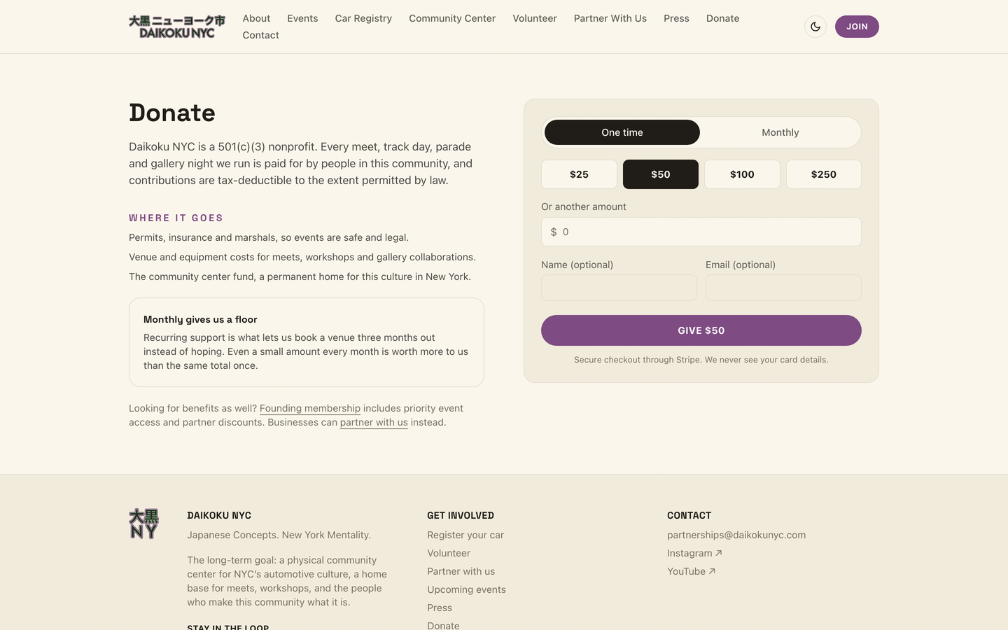
Members get automatic confirmations. Organisers get a queue instead of an inbox. Producers get a filter instead of an afternoon. Donations, one-time or monthly, went from impossible to two taps.
The number I care about most is the least impressive one: nobody who fills in a form disappears any more. That was not true before, and nothing on screen said so.
Learning
Almost everything that went wrong in this build looked like it was working.
The contact form said "You're in" while saving nothing, because the database was rejecting every one of those writes and the code never checked whether they succeeded. The staff tools showed an empty organization while 542 cars sat in the database, because of one wrong key in a settings panel. The old photo links returned a success code and served a login page instead of a picture.
None of these produced an error message. Each one was found by checking the result rather than the screen: submitting the form and then looking in the database for the record, following the link instead of trusting that it loaded.
That is the thing I took from this. Testing whether something looks right is not the same as testing whether it worked, and the gap between those two is where the real problems live. Every fix here was as much about making the system say when it is broken as about the break itself.
The second lesson came from designing for infrequent users. Most people who sign in here do it every few weeks, around an event, and they will not remember how anything works. That is what drove the choices I would otherwise have argued about. Put the count of what is waiting in the navigation, so the first screen answers "what needs me". Show the recipient count next to the send button, because someone will otherwise email five hundred people by accident. And say what a text will cost before it goes out. None of that is for an expert. It is for a volunteer on a Tuesday.