Personalization Component
A pre-purchase step that let customers set their own context before entering the buy flow. Designed, tested, and shipped.
- Company
- AT&T
- Year
- 2023
- Role
- Product Designer, Research & Innovation
- Category
- Experimentation & Growth
- Figma
- Adobe Analytics
+20%
Add to cart
+14%
Order conversion
+17%
Fiber order conversion
~$300,000
Projected 30-day value
Context
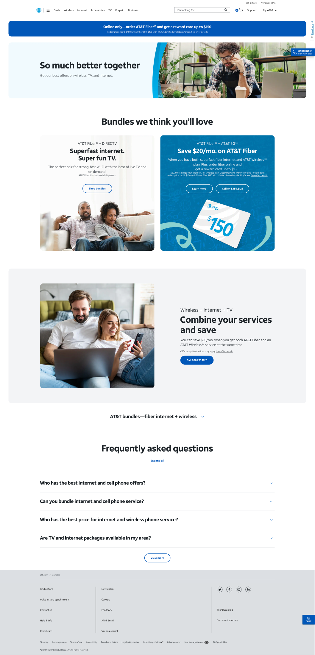
AT&T relaunched its Bundles page in March 2023 to work as a hub for every kind of bundle, not just TV and broadband paired together. That changed what the page had to do. It used to solve one predictable combination; now it had to route visitors toward wireless, fiber, and TV combinations depending on who showed up. The team looked at solving this with segmentation, showing different visitors different curated content, but a segmented Bundles page risked just repeating what those same visitors would already find on AT&T's other, more specific pages. Segmentation also has a chicken-and-egg problem: you can't tailor a page to someone before you know anything about them.
Problem
The business believed a more prominent entry point on the page would raise engagement. My job was figuring out what would actually test that belief.
There was a sharper question underneath it. Some visitors arrive at a Bundles page browsing, open to whatever is presented to them. Some already know exactly what they want, an existing customer looking to add one specific service, for instance. We came to call these two groups browsers and targeted shoppers. A curated grid of offers works fine for a browser. For a targeted shopper it is friction, an extra decision standing between them and the thing they came for.
The hypothesis we went in with was deliberately narrow, so a null result would still tell us something: if we give people a self-serve way to build a bundle, overall page conversion improves.
Solution
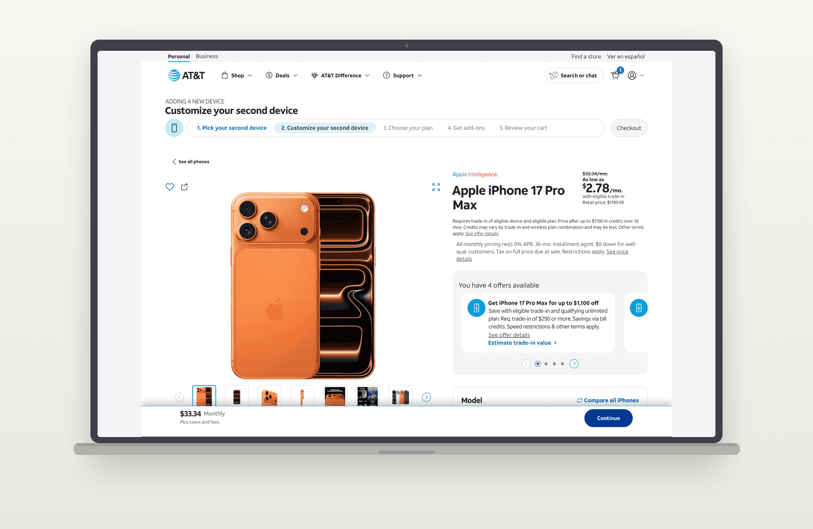
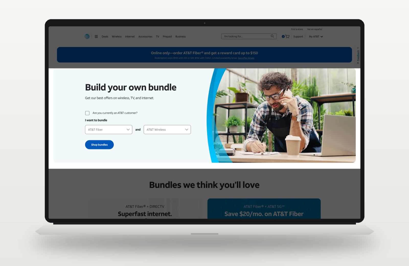
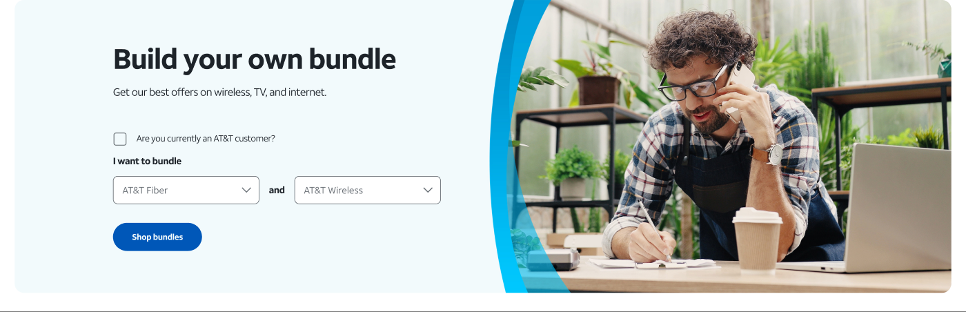
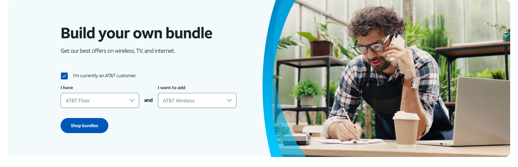
The fix lived entirely in the page's top marquee: a two-question hero layered above the same static offer grid, left untouched on purpose so anyone who preferred to just browse still could. It opens with two linked dropdowns for building a bundle, and one checkbox: "Are you currently an AT&T customer?"
Left unchecked, the two dropdowns stay generic, any two services a new customer might want to pair together, wireless and fiber, internet and DIRECTV. That's the browsing path: pick a pairing, hit Shop bundles, and go straight to that combination instead of scrolling the grid below to find it.
Checking the box changes what the first dropdown offers. Instead of every product, it now lists only what the customer already has, relabeled I have, with the second dropdown becoming I want to add. A small tooltip next to the checkbox covers the edge case of a customer with more than one existing service: pick whichever one you're building from. The Shop bundles button updates to match, carrying an existing wireless customer who wants fiber, for instance, straight into that specific upgrade path instead of a generic new-customer offer.
Built and tested across desktop and mobile, and run through three rounds, an early look, a longer first pass, and a final 28-day confirmatory run from November 10 to December 7, 2023, before the result was trusted enough to ship.
Customer Journey
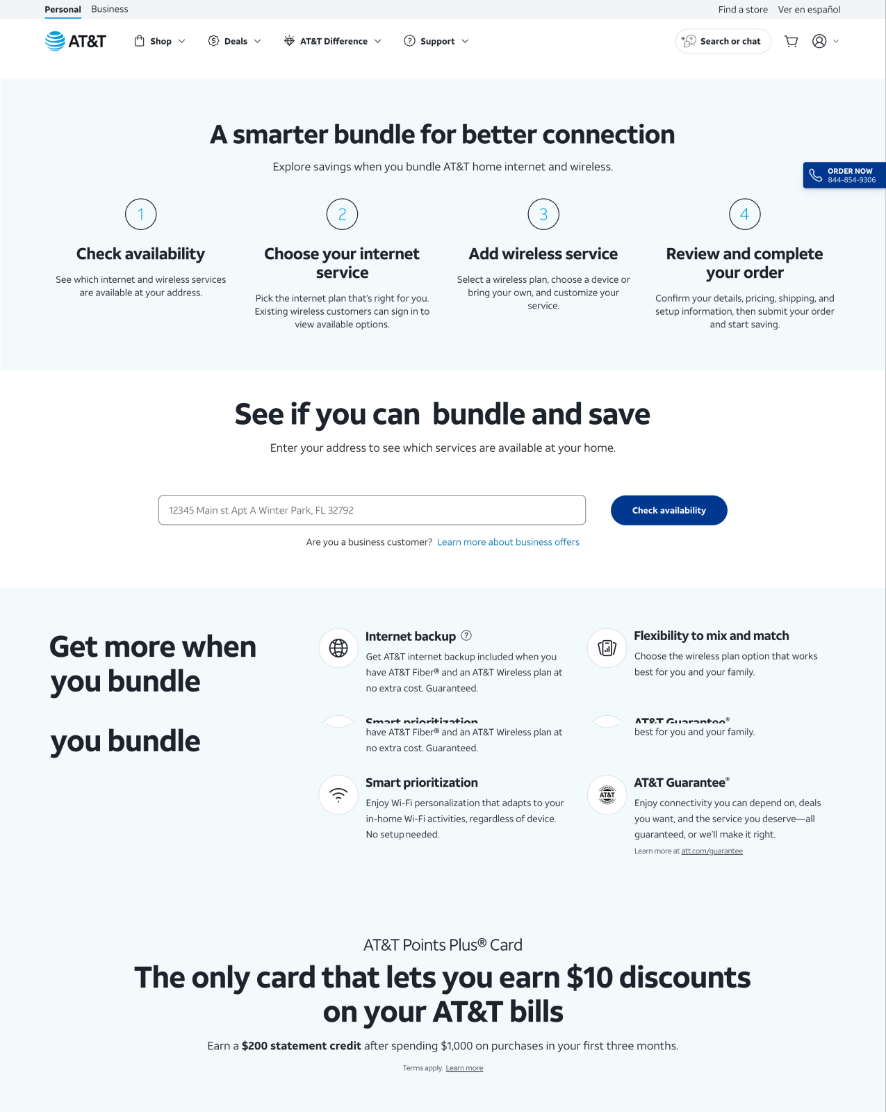
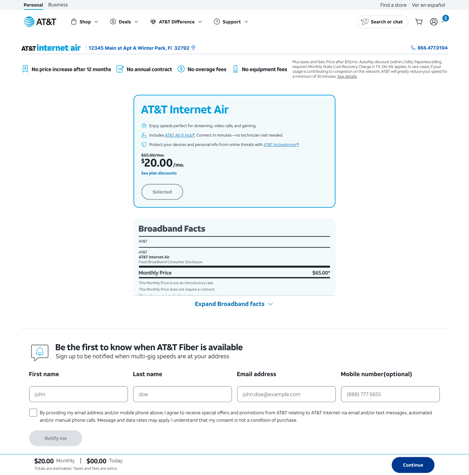
For a new customer, the next step is a check-availability flow: enter an address, and the page walks through what internet and wireless service is actually available there before any specific plan gets chosen. It's discovery first, offer second.
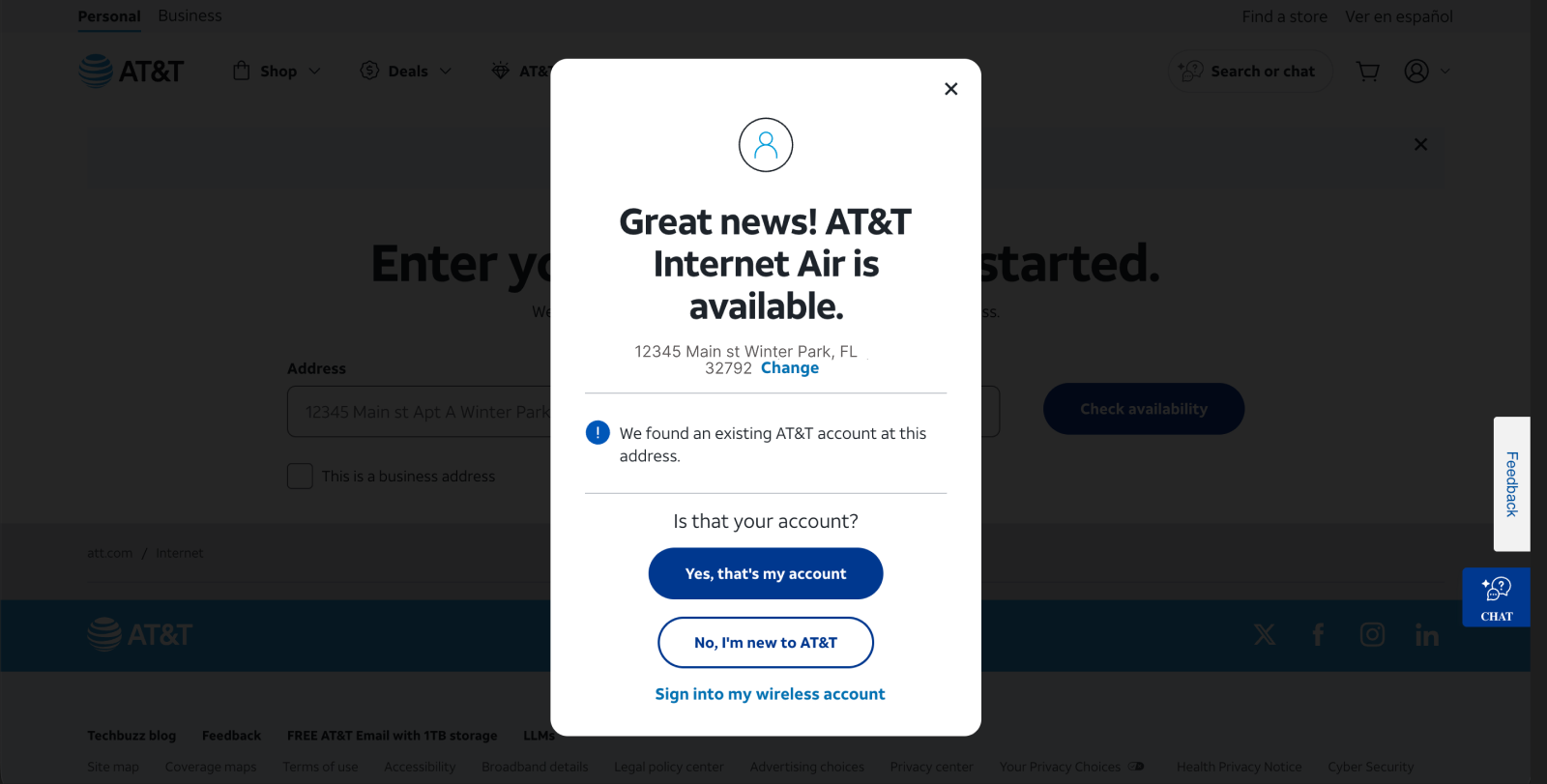
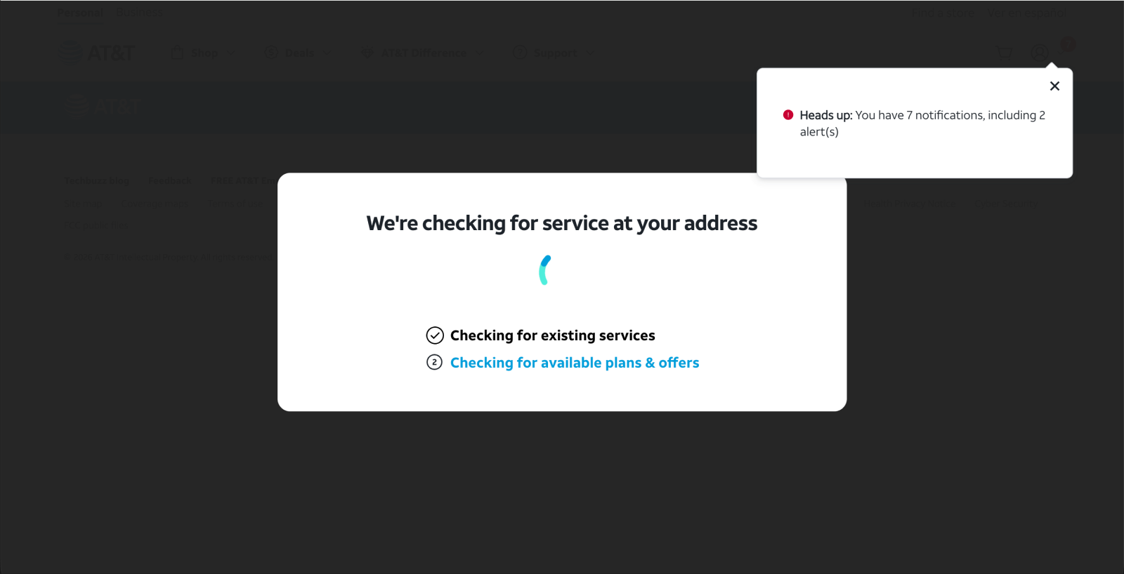
For an existing customer, the hero already told the site who they were, so what happens next is closer to recognition than discovery. A quick check confirms whether there's already an account tied to that address. A short loading state looks up existing services and eligible offers. Then the customer lands on a plan already priced around what they have, rather than a generic new-customer rate.
Impact
The component won clearly on the metric it was built to move. Site-wide it lifted add to cart by about 20% and order conversion by about 14%, both at very high confidence. Broken out by service, fiber saw the largest gains at about 36% more add to carts and 17% more completed orders, with broadband close behind at about 30% and 16%.
The sharpest result landed exactly where the component was aimed. For existing wireless customers adding fiber, and existing internet customers adding wireless, the lift was over 20% in both cases. Those are the targeted shoppers, self-identifying and going straight to what they already wanted.
Finance put the projected 30-day value of the test at roughly $300,000.
One honest caveat: the phone channel did not move. Customers who called in rather than browsing the page saw no meaningful shift in either direction. The win was specific to the self-serve experience it was designed for, not a lift that showed up everywhere at once.
Learning
The business's instinct was right, but not for the reason it assumed. Making the entry point more prominent wasn't what moved the numbers. Letting people say who they were and what they wanted, before anything else on the page tried to guess for them, was. A generic entry point serves a browser fine. It's dead weight for anyone who already knows why they came.